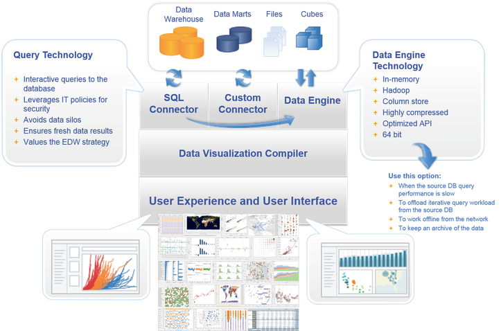
SIGN UP

Data visualization

Data visualization is viewed by many disciplines as a modern equivalent of visual communication. It involves the creation and study of the visual representation of data. To communicate information clearly and efficiently, data visualization uses statistical graphics, plots, information graphics and other tools.

Sample Architecture


Cinque Terre

Tableau
Tableau is often regarded as the grand master of data visualization software and for good reason. Tableau has a very large customer base of 57,000+ accounts across many industries due to its simplicity of use and ability to produce interactive visualizations far beyond those provided by general BI solutions. It is particularly well suited to handling the huge and very fast-changing datasets which are used in Big Data operations, including artificial intelligence and machine learning applications, thanks to integration with a large number of advanced database solutions including Hadoop, Amazon AWS, My SQL, SAP and Teradata. Extensive research and testing has gone into enabling Tableau to create graphics and visualizations as efficiently as possible, and to make them easy for humans to understand.

Qlikview
Qlik with their Qlikview tool is the other major player in this space and Tableau's biggest competitor. The vendor has over 40,000 customer accounts across over 100 countries, and those that use it frequently cite its highly customizable setup and wide feature range as a key advantage. This however can mean that it takes more time to get to grips with and use it to its full potential. In addition to its data visualization capabilities Qlikview offers powerful business intelligence, analytics and enterprise reporting capabilities and I particularly like the clean and clutter-free user interface. Qlikview is commonly used alongside its sister package, Qliksense, which handles data exploration and discovery. There is also a strong community and there are plenty of third-party resources available online to help new users understand how to integrate it in their projects.

FusionCharts
This is a very widely-used, JavaScript-based charting and visualization package that has established itself as one of the leaders in the paid-for market. It can produce 90 different chart types and integrates with a large number of platforms and frameworks giving a great deal of flexibility. One feature that has helped make FusionCharts very popular is that rather than having to start each new visualization from scratch, users can pick from a range of "live" example templates, simply plugging in their own data sources as needed.

Highcharts
Like FusionCharts this also requires a licence for commercial use, although it can be used freely as a trial, non-commercial or for personal use. Its website claims that it is used by 72 of the world's 100 largest companies and it is often chosen when a fast and flexible solution must be rolled out, with a minimum need for specialist data visualization training before it can be put to work. A key to its success has been its focus on cross-browser support, meaning anyone can view and run its interactive visualizations, which is not always true with newer platforms.

Datawrapper
Datawrapper is increasingly becoming a popular choice, particularly among media organizations which frequently use it to create charts and present statistics. It has a simple, clear interface that makes it very easy to upload csv data and create straightforward charts, and also maps, that can quickly be embedded into reports.

Plotly
Plotly enables more complex and sophisticated visualizations, thanks to its integration with analytics-oriented programming languages such as Python, R and Matlab. It is built on top of the open source d3.js visualization libraries for JavaScript, but this commercial package (with a free non-commercial licence available) adds layers of user-friendliness and support as well as inbuilt support for APIs such as Salesforce.